The Charts Come Last
Most BI Analyst candidates walk into a dashboard design interview ready to talk about chart types, color palettes, and tool features. The interview does not test any of that in the first seven minutes. Those seven minutes test whether you can frame a dashboard around a decision problem rather than around data volume, and 60 of 100 rubric points rest on exactly that distinction.
This is a simulated mock interview for a mid-level Business Intelligence Analyst at a leading tech company, focused on dashboard and data visualization design. If you are preparing for Business Intelligence Analyst roles, this is the question type that shows up in the design round. The mistakes here are common coaching patterns, not transcripts of real sessions.
Key Findings
- 60 of 100 rubric points go to Interviewer Objectives Alignment (30 pts) and Level-Specific Expectations (30 pts), the two framing dimensions.
- Phase 1 (0-7 min) holds 4 explicit checklist items, none of which mention a specific chart type or metric name.
- Phase 2 spans 12 minutes (7-19 min) with 6 checklist items covering layout, metric grouping, visual encoding, color use, annotations, and selective interactivity.
- Phase 3 (19-27 min) holds 5 checklist items exclusively about trust: data freshness, statistical noise, accessibility, performance constraints, and metric definition ownership.
- Mid-level bar: expected to independently structure the dashboard around a weekly review cadence and propose a sensible metric hierarchy without heavy prompting.
- 4 forbidden skill areas for this interview: production SQL, ML forecasting models, ETL pipeline depth, and distributed systems architecture.
- The final 3 minutes (27-30 min) are reserved for synthesis: a coherent user flow summary, a v1 scope statement, and the trade-offs made.
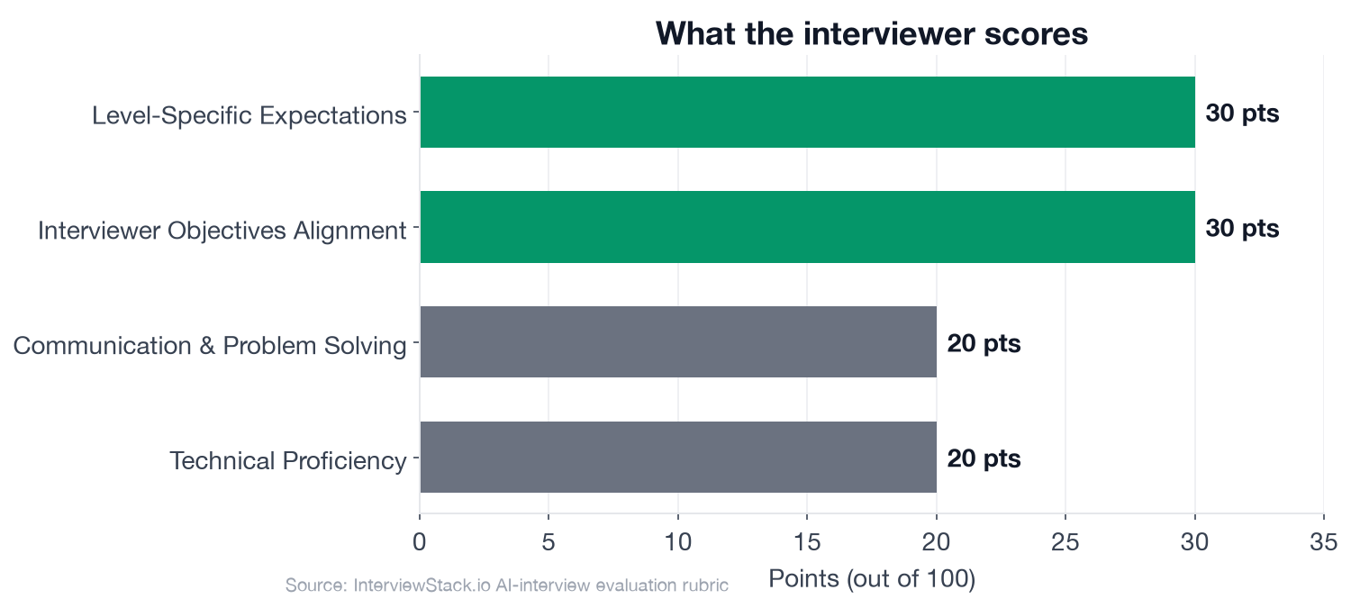
The two framing dimensions account for 60 of the 100 rubric points, which is why chart knowledge alone cannot rescue a weak Phase 1.
The Business Intelligence Analyst Dashboard Design Interview
The interview question
A rideshare company is preparing for a weekly operations review for the city operations team. The team manages driver supply, rider demand, marketplace efficiency, and service reliability across major metro areas. They currently rely on several disconnected reports and want a single dashboard that helps regional operations managers quickly understand what changed this week, where attention is needed, and what actions to take.
Your stakeholders include:
Regional Operations Managers, who need a fast weekly read on city performance
A Director of Operations, who wants an executive summary across cities
Analysts, who may need to drill into issues after the meeting
Assume the dashboard will be built in a standard BI tool and powered by large, regularly refreshed datasets.
How would you design this dashboard so it supports the weekly operations review effectively?
The interviewer's real objective is not a finished wireframe. It is to see whether you treat this as a decision problem first and a visualization problem second. Phase 1 probes whether you identify the primary user, clarify the review context, map the decision areas, and separate overview from drill-down before naming a single chart type. Candidates who start listing metrics in the first two minutes are already scoring against a rubric they have not read.
What Does the Interview Probe, Turn by Turn?
Turn 1: Metrics and Grouping
Interviewer: "What core metrics would you include first, and how would you group them so the dashboard matches how operations managers make decisions?"
Turn 2: Stakeholder Trade-offs
Interviewer: "If one stakeholder asks for many filters and drill-downs while another wants a very simple executive view, how would you handle that trade-off in your design?"
Turn 3: Data Freshness and Trust
Interviewer: "Suppose some city-level metrics are delayed or backfilled after the refresh. How would you design the dashboard so users can still trust and interpret what they are seeing?"
Turn 4: Statistical Noise in Small Markets
Interviewer: "How would statistical significance or confidence affect how you present week-over-week changes, especially for smaller cities with noisy metrics?"
Spotting these mistakes on the page is straightforward. Avoiding them live, under time pressure with unscripted follow-ups arriving every 5-7 minutes, is a different skill. The framing mistake happens in the first 2 minutes and sets a ceiling on everything that follows. The trust mistakes surface when you are deep in visualization design and under pressure to show tool knowledge. Building the reflex to catch them in the moment only comes from reps in realistic conditions.
The InterviewStack.io AI mock interview runs the full 4-phase blueprint in real time, adapts to your answers, and scores you across all four rubric dimensions immediately after. For focused preparation before the full simulation, the BI Analyst question bank covers this topic and the full range of dashboard and visualization questions. Browse open Business Intelligence Analyst roles to see what employers are currently hiring for.
The Complete Blueprint
This is the exact blueprint the AI mock interview tracks in real time. A candidate who hits every phase and checklist item earns the full score across all four rubric dimensions. Frame it as what you are working toward, not a checklist to memorize.
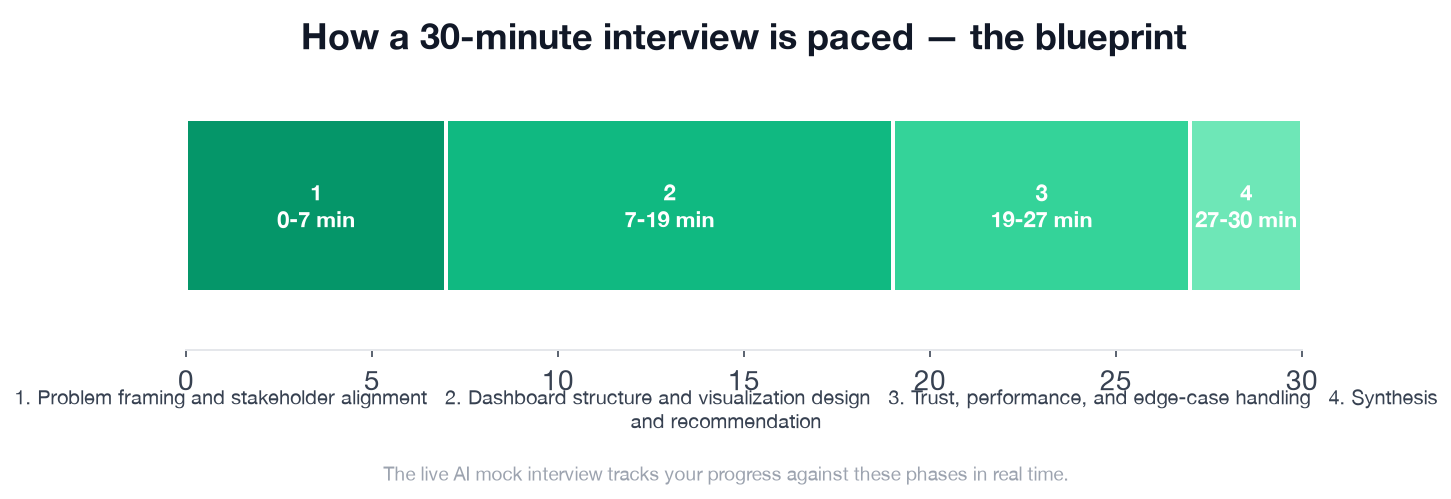
The 7-minute Phase 1 carries outsized weight: it sets the ceiling on both framing dimensions. Phase 2 is the longest block (12 minutes), where the actual visualization design plays out. Phase 3 separates candidates who can design for the real world from candidates who can design for a demo.
- ✓Asks or states who the primary user is for the default view
- ✓Clarifies that the dashboard must support a weekly review and action-taking, not just historical browsing
- ✓Identifies likely decision areas such as supply-demand balance, service reliability, and city-level exceptions
- ✓Introduces a prioritization approach for overview versus drill-down use cases
- ✓Proposes a clear top-to-bottom or left-to-right layout with executive summary first and supporting detail below or behind interactions
- ✓Groups metrics into meaningful sections such as demand, supply, conversion or fulfillment, reliability, and city comparisons
- ✓Chooses appropriate visuals, for example compact KPI cards with context, trend lines for week-over-week movement, ranked bars or heatmaps for city comparison, and limited tables only where needed
- ✓Explains when to use color for status or exception emphasis and avoids relying on color alone
- ✓Includes annotations, benchmarks, or targets so changes are interpretable rather than raw numbers alone
- ✓Uses interactivity selectively, such as a city filter, date window, drill-down, or tooltip, while preserving an easy default read
- ✓Addresses data freshness, latency, or backfill with visible timestamps, freshness indicators, or caveats
- ✓Recognizes noisy small-sample comparisons and suggests confidence intervals, minimum volume thresholds, or subdued presentation for unstable metrics
- ✓Mentions accessibility practices such as color contrast, labels, keyboard-friendly interactions, or screen-size-aware simplification
- ✓Shows awareness of performance constraints, such as reducing expensive cross-filters, pre-aggregating common views, or limiting default detail
- ✓Considers maintenance needs like consistent metric definitions and ownership of dashboard logic
- ✓Summarizes the proposed dashboard in a coherent user flow
- ✓States what would be in scope for version one versus later enhancements
- ✓Articulates the main trade-offs made and why they fit the stakeholder needs
FAQ
Q. What does a Business Intelligence Analyst dashboard design interview actually test?
A BI Analyst dashboard design interview primarily tests whether you can frame a dashboard around a decision problem and stakeholder workflow, not just your chart knowledge. 60 of 100 rubric points go to Interviewer Objectives Alignment (30 pts) and Level-Specific Expectations (30 pts), both of which reward structured problem framing in the first 7 minutes.
Q. How long is a typical BI Analyst dashboard design interview?
The standard format is 30 minutes across 4 phases: problem framing and stakeholder alignment (0-7 min), dashboard structure and visualization design (7-19 min), trust and edge-case handling (19-27 min), and synthesis (27-30 min).
Q. What are the most common mistakes in a BI Analyst dashboard interview?
The most common mistake is jumping straight to metric lists and chart types without first clarifying who the primary user is and what decisions the dashboard must support. This skips Phase 1's 4 checklist items and costs up to 60 points in the two framing dimensions.
Q. How should a mid-level BI Analyst structure a dashboard design interview?
At mid-level (2-5 years), you are expected to independently structure the dashboard around a business review cadence and propose a sensible metric hierarchy without heavy prompting. Start by clarifying the primary audience, the decision use case, and the overview versus drill-down split before naming any specific metric or chart type.
Q. How do you handle data freshness and trust in a BI Analyst dashboard interview?
Address data freshness by proposing visible timestamps, freshness indicators, or explicit caveats where metrics may lag. For noisy metrics (especially small-city comparisons), suggest confidence intervals, minimum volume thresholds, or subdued visual presentation. These are explicit Phase 3 checklist items the interviewer expects a mid-level candidate to raise without prompting.
Q. What chart types should I use in a BI Analyst dashboard interview?
Chart selection matters less than the reasoning behind it. Strong candidates explain that KPI cards work for executive summary status, trend lines reveal week-over-week movement, ranked bar charts or heatmaps work for city comparisons, and tables should be used sparingly. The key is matching the visual encoding to the decision type.
Q. How do I practice for a Business Intelligence Analyst dashboard design interview?
Practice live, timed simulation with unscripted follow-ups rather than reading about the topic. The InterviewStack.io AI mock interview runs the full 4-phase blueprint in real time and scores your response across all four rubric dimensions, so you get immediate feedback on where your framing and chart reasoning fall short.
Where the Interview Is Actually Won
The rubric rewards two things before any chart type is discussed: whether you understood that the stakeholders need to make decisions, and whether you independently structured the dashboard around that need. Get Phase 1 right, and everything in Phases 2 and 3 flows from a defensible foundation. Miss it, and you are answering a different question than the interviewer is scoring.
Topics
Ready to practice?
Put what you've learned into practice with AI mock interviews and structured preparation guides.