
The Data Analyst Business Intelligence and Reporting Infrastructure Interview Rewards Numbers You Can Defend
You are a mid-level Data Analyst, moments into a 30-minute interview, and the scenario has already told you the dashboards disagree. Not "might disagree." Do disagree, today, in production, and finance and operations are both tired of it. The interviewer isn't handing you a blank canvas; they're handing you a mess and watching how you clean it up.
This walkthrough is built on one real AI-interview blueprint (the same package structure our AI interviewer generates and scores against), covering a Data Analyst interview on Business Intelligence, Reporting, and Dashboards at the mid-level (2-5 years). The scoring is 100 points across four weighted dimensions, and most of it is decided before a single chart gets designed.
Key Findings
- Interviewer Objectives Alignment and Level-Specific Expectations each carry 30 of 100 points, 60 total, and both are graded on how you frame the problem, not how many KPIs you list.
- The Semantic layer and dashboard design phase (minutes 7-20) packs 6 separate checklist items into 13 minutes.
- 4 source tables are given, and 2 of them (a daily snapshot and a transaction log) are designed to disagree with each other in specific, explainable ways.
- The interview names a concrete failure case: a drill-down view that stalls at 20 seconds after filtering by country and plan tier.
- Only 7 of the 30 minutes (0-7) are allotted to establishing trust, audience, and performance as requirements before any dashboard widget gets designed.
- Technical Proficiency and Communication & Problem Solving split the remaining 40 points, both scored on structured reasoning, not just correct conclusions.
- Just 3 minutes (27-30) are left for prioritization and stakeholder sign-off at the close.
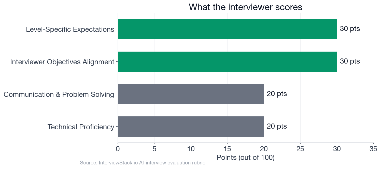 Framing and level-specific judgment together outweigh raw technical execution, 60 points to 40.
The Scenario: A Dashboard Built on Disagreement
The interview question
You support a consumer subscription product with executives, finance, and operations teams all using dashboard reporting. The company currently has inconsistent metric definitions across Tableau and Looker dashboards, slow dashboard load times during business hours, and frequent questions about why numbers differ between weekly reports.
A new leadership request asks for a single "Subscription Health" dashboard that will be used in weekly business reviews and by managers during the week for drill-down analysis. The core source tables available are:
-- daily grain subscription status snapshot subscription_daily_status ( snapshot_date DATE, user_id STRING, subscription_id STRING, plan_tier STRING, billing_country STRING, subscription_status STRING, -- active, paused, canceled, trial is_trial BOOLEAN, mrr_usd NUMERIC, start_date DATE, cancel_date DATE )-- event-level billing activity billing_transactions ( transaction_id STRING, user_id STRING, subscription_id STRING, transaction_ts TIMESTAMP, transaction_type STRING, -- renewal, refund, initial_purchase, retry_success, chargeback amount_usd NUMERIC, currency STRING, transaction_status STRING -- success, failed )
-- support tickets support_tickets ( ticket_id STRING, user_id STRING, created_ts TIMESTAMP, issue_type STRING, resolution_hours NUMERIC, csat_score NUMERIC )
-- product engagement summary at user-day grain user_engagement_daily ( event_date DATE, user_id STRING, sessions INT64, minutes_watched INT64, devices_used INT64 )
How would you design and deliver this Subscription Health dashboard so that business users can trust the numbers, answer common drill-down questions, and use it interactively without performance issues?
The interviewer's objectives are explicit about what they are and are not testing: can you translate a vague leadership request into precise metrics, propose a practical semantic layer, make sound dashboard design calls, and reason about refresh, trust, and performance trade-offs at a mid-level scope. Nobody is grading your Tableau chart-type vocabulary. They're grading whether the dashboard you describe would actually survive contact with finance asking "why doesn't this match last week's number."
Turn 1: Metrics Without Definitions
Interviewer: "How would you define the core metrics on this dashboard so finance and operations stop using conflicting numbers?"
Turn 2: Where Logic Lives
Interviewer: "What would you put in the semantic or metrics layer versus calculating directly in a dashboard tool?"
Turn 3: The 20-Second Filter
Interviewer: "Suppose users complain that one drill-down view takes 20 seconds to load after filtering by country and plan tier. How would you investigate and improve it?"
Turn 4: Two Truths, One Metric
Interviewer: "If cancellation counts from the status snapshot do not match counts inferred from transactions, how would you diagnose and communicate the discrepancy?"
Why Isn't Reading This Enough?
Every mistake above is easy to spot on the page. The wrong turn is already labeled red; the fix is already labeled green. That's not the skill being tested. The skill being tested is catching your own version of that mistake in real time, mid-sentence, while an interviewer is waiting on your answer and the clock has already burned through Phase 1. Reading a mismatch diagnosis is not the same as building one under pressure with no script. That gap only closes with reps.
What Does a Strong 30-Minute Interview Actually Look Like?
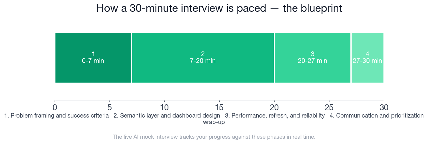 Trust and framing get 7 minutes up front; performance and reliability get their own dedicated phase before the close.
This is the blueprint a strong candidate hits, phase by phase, and it's the exact thing our AI interviewer tracks you against in real time as you talk.
- ✓Asks who the primary users are and distinguishes executive review from manager self-serve usage
- ✓Calls out the need for standardized metric definitions because current dashboards disagree
- ✓Identifies likely key outcomes such as retention/churn, active subscriptions, revenue, payment health, and support/engagement context
- ✓Mentions trust, drill-down usability, and performance as first-class requirements rather than afterthoughts
- ✓Proposes a source-of-truth metric layer or curated reporting tables rather than relying on ad hoc dashboard calculations across tools
- ✓Distinguishes which tables are best for point-in-time subscription metrics versus transaction-based revenue/payment metrics
- ✓Defines example KPIs with enough precision to reveal logic choices, such as active subscriptions, net MRR, churned subscriptions, renewal success rate, refund rate, trial conversion, or support burden
- ✓Outlines a dashboard hierarchy such as overview KPIs, trend section, segmentation filters, and drill-down/detail table
- ✓Describes meaningful drill-down dimensions like plan tier, billing country, acquisition cohort or status, while avoiding overly cluttered layouts
- ✓Recognizes edge cases like paused subscriptions, refunds, chargebacks, retries, and differences between daily snapshot counts and transaction events
- ✓Suggests pre-aggregated or modeled tables for common dashboard grains instead of hitting large event tables directly for every interaction
- ✓Mentions relevant optimization concepts such as partition pruning by date, clustering/filter-friendly keys, reducing high-cardinality joins, or extracting expensive calculations upstream
- ✓Proposes different refresh cadences for executive reporting versus operational monitoring if needed
- ✓Describes basic validation checks such as reconciliation between source and reporting tables, metric definition docs, or alerts on anomalous changes
- ✓Explains how they would investigate a slow view using query inspection, filter patterns, join logic, and dashboard computation review
- ✓Prioritizes an MVP with a small set of trusted KPIs and high-value drill-downs before expanding breadth
- ✓Identifies stakeholders needed for sign-off, such as finance for revenue logic and operations for cancellation/support definitions
- ✓Communicates trade-offs clearly, including what would be delivered now versus later
Practice the Full Interview Before It's Live
You've now seen four ways this specific interview gets away from a well-prepared candidate. The fastest way to make sure none of them get away from you is to run the scenario yourself, live, against an interviewer that follows this exact blueprint and scores you against these exact checklist items. Start the AI mock interview on business intelligence and reporting infrastructure and get feedback on your framing, your metric definitions, and your handling of the snapshot-versus-transaction trap before an interviewer hands it to you for real.
If you'd rather drill the underlying concepts first, semantic layer design, refresh trade-offs, dashboard performance, the business intelligence and reporting infrastructure question bank breaks the topic into focused practice questions, and the Data Analyst preparation guide rounds out the rest of the role.
FAQ
Q. What does a Data Analyst interview on business intelligence and reporting actually test?
It tests whether you can turn a vague "build me a dashboard" request into a trustworthy reporting system: precise metric definitions, a source-of-truth semantic layer, sensible dashboard architecture, and reasoning about refresh cadence, performance, and data-quality edge cases, not just tool familiarity with Tableau or Looker.
Q. How many rubric points come from how you frame the problem versus the technical build?
Interviewer Objectives Alignment and Level-Specific Expectations each carry 30 of the 100 total points, 60 in total, and both hinge on framing: identifying stakeholders, standardizing metric definitions, and making practical trade-offs. Technical Proficiency and Communication & Problem Solving split the remaining 40.
Q. What is a semantic or metrics layer, and why does it matter for this interview?
A semantic (or metrics) layer is a curated, modeled set of tables or definitions that compute business logic once, upstream of any dashboard tool, so every report pulls the same number for "active subscriptions" or "net MRR." The interview's expected checklist explicitly rewards proposing this over ad hoc calculations built separately in Tableau and Looker.
Q. Why would a subscription count from a daily snapshot table differ from one built off transaction events?
A daily snapshot table records subscription state as of a point in time, while a transaction log records discrete billing events. A cancellation can post as a transaction mid-day before the next snapshot reflects it, or a chargeback can appear in transactions with no status change at all, so the two can legitimately disagree without either being wrong.
Q. How should I investigate a dashboard drill-down that takes 20 seconds to load?
Work through the layers in order rather than guessing at a fix: check whether the dashboard queries raw event-grain tables instead of a pre-aggregated table, look for high-cardinality joins happening before filters are applied, and confirm whether expensive aggregation is running inside the dashboard tool instead of the warehouse.
Q. How long is this mock interview and how is it scored?
The full interview runs 30 minutes across four phases (problem framing, semantic layer and dashboard design, performance and reliability, and prioritization), scored out of 100 points across four weighted dimensions, mirroring what a mid-level Data Analyst would face in a real BI-focused interview.
Q. Where can I practice this exact interview format?
You can run the full AI mock interview on this scenario, or drill focused practice questions on business intelligence and reporting infrastructure in the question bank, both linked in this post.
Two Numbers Can Both Be Right
The trap in this interview was never a bad query or a missing chart. It was mistaking two structurally different data sources for one that had simply broken. Get comfortable saying "these numbers disagree, and here is exactly why" instead of chasing false agreement, and you're already ahead of most candidates who walk in.
Topics
Ready to practice?
Put what you've learned into practice with AI mock interviews and structured preparation guides.