
The Product Designer Responsive, Multi-Platform, and Localized Design Interview Tests Localization Before It Ever Comes Up
You're seven minutes into a mid-level Product Designer interview when the prompt shifts from "design a unified inbox" to "now make it work across desktop web, iOS, and Android." Thirteen minutes later, it shifts again: the same product needs to work for a market that reads right to left. Everything you sketched for the English, left-to-right, desktop-first version is still on the whiteboard, and the interviewer is about to find out whether it can survive contact with a language that runs the other direction.
This walkthrough follows one full 30-minute simulated interview, built on the same blueprint InterviewStack's AI mock interviewer uses to run and score real Product Designer candidates: a unified messaging inbox for a scheduling app, three platforms, a global audience, and a 100-point rubric spread across four dimensions. Watch where a well-prepared mid-level candidate still gives points away, then see the complete blueprint an interviewer is actually grading against.
Key Findings
- The rubric splits 100 points across four dimensions: Interviewer Objectives Alignment (30), Level-Specific Expectations (30), Technical Proficiency (20), and Communication and Problem Solving (20).
- The 30-minute interview runs three phases: 0-7 minutes to frame the problem, 7-20 minutes (the longest phase, 13 minutes) for cross-platform structure, and 20-30 minutes for localization and trade-offs.
- Phase 2 alone packs 6 expected checklist items into those 13 minutes, more than Phase 1's 4 or Phase 3's 5.
- Four skill areas are explicitly off-limits: typography or color-only critique, front-end implementation, growth marketing, and brand or copywriting strategy.
- The scenario spans three platforms (desktop web, iOS, Android) and markets that need right-to-left layouts and multiple languages, but localization is only explicitly graded in the last 10 of 30 minutes.
- Six follow-up prompts probe breakpoint decisions, one-handed mobile use, localization timing, a single shared design-system constraint, information prioritization under limited space, and validation.
- At mid-level (2 to 5 years), the bar is a structured approach with sensible assumptions and clear trade-offs, not an exhaustive solution for every edge case.
What Is the Interviewer Actually Scoring in This Unified Inbox Scenario?
The interview question
You're joining an onsite loop for a product design role on a productivity suite used by small businesses around the world. One of the company's core products is a scheduling and messaging experience that lets business owners manage appointments, message customers, and confirm bookings. The team wants to launch a new unified inbox where a business owner can see incoming customer conversations, review the appointment details tied to each conversation, send quick replies or confirmations, and manage all of this on desktop web, iPhone, and Android.
The product already has strong adoption in North America and is expanding into markets that require right-to-left support and multiple languages. Designers on this team are expected to create solutions that feel native to each platform without fragmenting the product experience.
How would you approach designing this unified inbox so it works well across desktop web, iOS, and Android for a global audience?
The interviewer isn't grading whether the inbox looks polished. They're checking whether you scope the problem around the business owner's real tasks and context before touching layout, propose a responsive structure that holds together across breakpoints and platforms, apply the interaction conventions each platform's users already expect, and build room for a global, multilingual audience into the design from the first decision rather than as a translation pass at the end.
Four Follow-Ups That Show Where Flexibility Breaks Down
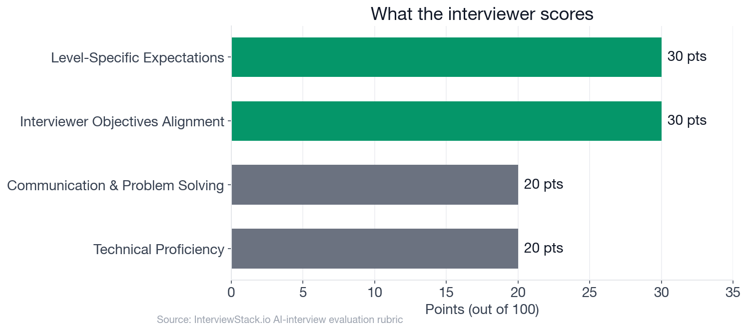
Interviewer Objectives Alignment and Level-Specific Expectations carry 60 of the 100 points combined, more than Technical Proficiency and Communication and Problem Solving's 40 combined, and both of the 30-point dimensions hinge on decisions made well before localization is ever explicitly asked about. That is exactly where a candidate we'll call Sana starts giving points back.
Turn 1: Consistent Doesn't Mean Identical
Interviewer: "How would you decide what changes across breakpoints versus what should stay consistent across platforms?"
Turn 2: Every Field, Equal Weight
Interviewer: "How would you prioritize the information shown in the conversation list and detail view when screen space becomes constrained?"
Turn 3: Mirroring Is Not Localizing
Interviewer: "How would you design for longer translated strings, different date and time formats, and right-to-left layouts without treating localization as a later adaptation?"
Turn 4: One Design System, Not One Look
Interviewer: "Suppose engineering says the first release can support only one shared design system foundation with limited platform-specific custom work. What would you standardize and where would you still insist on platform differences?"
Why Doesn't Recognizing the Fix on the Page Make It Automatic Live?
Every mistake above is obvious once it's labeled in a red box. Under real interview pressure, with the clock running and Phase 2 alone handing you six checklist items in thirteen minutes, noticing that your own conversation-list layout just hard-coded an English string length is a different skill than reading about it after the fact. This post teaches you to spot the pattern. It doesn't teach you to hold three platforms and a global audience in your head while sketching a structure out loud, catch yourself locking in a fixed-width layout mid-sentence, and adjust before the interviewer has to ask.
That gap only closes with reps. Start a live AI mock interview on responsive and multi-platform design and get scored against this same rubric while the clock is actually running, not after the fact.
How Does a Strong Candidate Actually Spend These 30 Minutes?
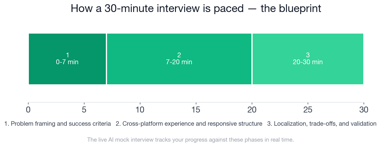
The chart paces the same 30 minutes into the three phases the interviewer is actually timing against: framing first, cross-platform structure second, localization and trade-offs last. The card below is the full checklist inside each phase, the exact thing the AI mock interviewer tracks against in real time as you talk.
- ✓Clarifies who the primary user is and what top tasks matter most in the inbox
- ✓Identifies likely usage contexts across desktop and mobile rather than treating all devices the same
- ✓Defines a manageable MVP scope for the unified inbox
- ✓Mentions success signals such as faster response, fewer missed bookings, or smoother message handling
- ✓Describes a desktop structure that sensibly uses available space, such as list-detail or multi-pane patterns
- ✓Explains how the same experience compresses or restructures on mobile rather than simply shrinking
- ✓Makes thoughtful decisions about what content is visible by default in conversation lists and detail views
- ✓Acknowledges touch ergonomics, thumb reach, and quick-reply workflows on mobile
- ✓Differentiates where iOS, Android, and web should follow native conventions for navigation, actions, gestures, or input behaviors
- ✓Keeps a coherent product model across platforms even when interaction details differ
- ✓Calls out flexible layout decisions for text expansion and variable content lengths
- ✓Addresses RTL implications beyond mirroring, such as hierarchy, icon direction, and alignment behavior
- ✓Mentions locale-aware formatting for dates, times, names, or phone numbers where relevant
- ✓Makes a reasonable call on what can be shared in the system versus what should remain platform-specific under engineering constraints
- ✓Suggests concrete validation approaches such as prototype testing across devices, pseudo-localization, or reviewing edge-case content states
Put the Blueprint to a Live Test
You've now seen every mistake this scenario is built to catch and the full checklist behind it. The next step is doing this live, out loud, on the clock, with follow-ups you can't preview in advance. Start the AI mock interview for Product Designer responsive and multi-platform design and get scored against this exact rubric in real time.
Want to drill the individual pieces first, breakpoint strategy, right-to-left layout reasoning, platform convention trade-offs, before putting them together live? Work through the responsive and multi-platform design question bank, or browse company-specific prep guides if a specific interview process is next on your calendar.
FAQ
Q. What does a Product Designer responsive and multi-platform design interview actually test?
It tests whether you can design one coherent product experience that adapts across desktop web, iOS, and Android for a global audience, not whether you can produce polished visuals. The rubric splits 100 points across four dimensions: Interviewer Objectives Alignment (30), Level-Specific Expectations (30), Technical Proficiency (20), and Communication and Problem Solving (20), and it explicitly excludes typography or color-only critique, front-end implementation, growth marketing, and brand or copywriting strategy, keeping the conversation scoped to product and interaction design decisions.
Q. How is the 30-minute interview paced?
Three phases: minutes 0 to 7 for framing the primary user, top tasks, and MVP scope, minutes 7 to 20 (the longest phase, carrying 6 expected checklist items) for cross-platform structure and responsive behavior, and minutes 20 to 30 for localization, trade-offs, and validation.
Q. Why can't localization be treated as a later adaptation in this interview?
Because the localization phase's checklist, flexible layouts for longer translated strings and RTL implications beyond simple mirroring, only scores well if the content model built during the earlier cross-platform phase was already flexible. A candidate who locks in fixed-width, English-only layouts in minutes 7 to 20 has no way to earn those points in minutes 20 to 30 without redesigning what they already presented.
Q. What's the difference between what should stay consistent across platforms and what should change?
What should stay consistent is the underlying task model, seeing a conversation, its linked appointment, and a way to reply, along with the overall information hierarchy. What should change is navigation pattern, information density, and how content compresses or restructures for a smaller screen, plus platform-native conventions for gestures and actions on iOS versus Android versus web.
Q. How should a one-handed mobile interaction change the design?
The rubric rewards acknowledging thumb reach and quick-reply workflows explicitly: primary actions like replying or confirming a booking need to sit within easy one-handed thumb range, and a business owner moving between appointments benefits from shorter, lower-friction interaction patterns, like quick-reply templates and one-tap confirmations, over interactions that assume two hands and full attention.
Q. What should be validated before finalizing the design direction?
The rubric looks for a few concrete, lightweight validation approaches rather than an exhaustive research plan: testing prototypes across real devices and locales, pseudo-localization to catch layout breaks before full translation exists, and reviewing edge-case content states like very long names or a fully booked day. A mid-level candidate is expected to name a few key risks and how to check them, not to solve every edge case in the room.
Q. What's off-limits in this interview?
Four areas are explicitly out of scope: visual design critique focused only on typography or color aesthetics, front-end implementation or coding details, growth marketing strategy, and brand positioning or copywriting. The interview stays scoped to product thinking, interaction design, and cross-platform and localization reasoning.
What You Build by Minute Twenty Decides Minute Thirty
Everything in this interview, the breakpoint strategy, the field prioritization, the design-system negotiation, funnels back to one question: did you build the content model flexible enough to survive a market you haven't designed for yet? Get that right in the first twenty minutes, and localization in the last ten is a parameter change. Miss it, and the interview spends its final third proving that the polished English layout on your whiteboard was never actually finished. The only way to know you'd catch it live is to try it live.
Topics
Ready to practice?
Put what you've learned into practice with AI mock interviews and structured preparation guides.