
The Subtle Shadow Is Not a Selected State
The PM loves the onboarding redesign. It is polished and card-based, and the selected state is a faint color shift with a soft shadow. Engineering wants guidance now, not a retrofit later. You are the UI Designer in a mid-level mock interview on accessibility and inclusive design, and the interviewer is waiting to hear what you do with that one sentence.
This walkthrough comes from a real InterviewStack.io AI-interview blueprint. Dana, our illustrative candidate, knows contrast ratios and ARIA vocabulary and still leaks points, because the interview rewards specifying decisions engineers can build rather than describing values. If you design for the web, see current UI Designer openings to see where this skill gets asked.
Key Findings
- 60 of 100 rubric points (30 + 30) go to Interviewer Objectives Alignment and Level-Specific Expectations.
- Technical Proficiency is 20 of 100 points; Communication & Problem Solving is the other 20.
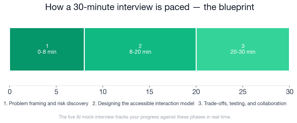
- The interview runs 30 minutes in 3 phases: 0-8, 8-20 and 20-30 minutes.
- 17 checklist items (5, 7 and 5) define what a strong answer hits.
- The sign-up flow has 5 screens, and each one is a place for an accessibility barrier.
- 6 follow-up prompts are available; this walkthrough dramatizes 4 of them.
- 4 topics are explicitly out of scope, including workplace diversity programs and algorithmic fairness.
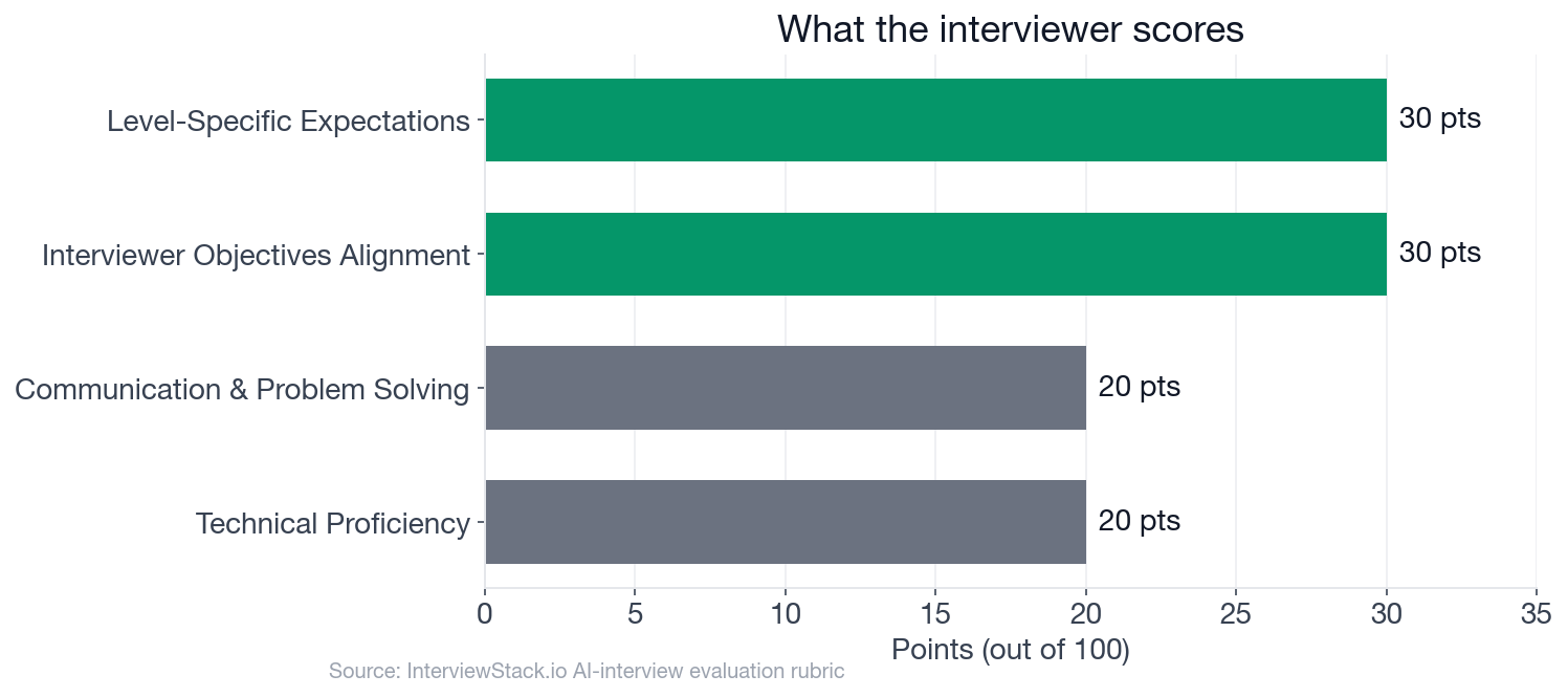
The four rubric dimensions by point weight, out of 100.
What Does the UI Designer Accessibility Interview Actually Ask?
The interview question
Imagine you are working on a consumer productivity product at a large tech company. The team is redesigning the account sign-up and onboarding flow in desktop web, and wants to ship quickly without creating accessibility debt.
The current flow has five screens: (1) a sign-up form with email, password, confirm password and a required terms checkbox; (2) an email verification step; (3) a profile setup form with display name, time zone and avatar upload; (4) a preference selection screen with several selectable cards; (5) a completion screen with a primary call to action.
The PM says the design direction is visually polished, heavily card-based, and uses subtle color-only states for success, warning and selection. Engineering can support design changes but wants clear guidance early, to avoid accessibility retrofits after implementation.
How would you approach designing this flow so it is accessible and inclusive from the start?
The interviewer is probing whether you can name barriers for keyboard, screen-reader, low-vision, color-blind, cognitive and motor-impaired users, turn principles into concrete design decisions, show restraint with ARIA, and describe how you would test and collaborate with engineering and research.
Four Follow-Ups, Four Places Points Leak
Turn 1: Keyboard-only path
Interviewer: "If a keyboard-only user goes through this flow, what interaction details would you want to define before engineering starts building?"
Turn 2: Color-only selection cards
Interviewer: "The visual designer wants selected preference cards to be indicated only by a color change and a subtle shadow. How would you respond?"
Turn 3: Broken third-party upload
Interviewer: "Suppose the avatar upload control comes from a third-party component library and has known accessibility issues. What would you do?"
Turn 4: Proving it works
Interviewer: "After launch, how would you validate that the experience is actually accessible for users with disabilities, not just theoretically compliant?"
Why Isn't Spotting These Mistakes Enough?
Every mistake above is obvious on the page. Live, it is different: you are mid-interview, the interviewer raises the visual designer's color-only cards, and you have to defend a specific focus order while the clock runs. Knowing the answer and producing it unscripted are different skills, and only repetition closes the gap.
What Does the Blueprint Check Once the Follow-Ups End?
This is the blueprint a strong candidate hits, phase by phase. It is also what the AI mock interview tracks you against in real time.
- ✓Clarifies or states reasonable assumptions about platform, scope, and user tasks
- ✓Breaks the flow into key touchpoints such as form entry, step transitions, selection controls, file upload, and completion
- ✓Names multiple disability/access needs relevant to the flow, not just vision-related concerns
- ✓Flags subtle color-only states, card selection, validation, and file upload as likely accessibility risks
- ✓Frames accessibility as something to shape requirements before implementation rather than an after-the-fact audit
- ✓Describes accessible labeling for form fields, required states, helper text, and terms checkbox
- ✓Explains how errors are surfaced visually and programmatically, including association to fields and usable recovery
- ✓Covers focus order, visible focus indication, and focus management across step transitions or async verification states
- ✓Replaces or supplements color-only selection/success/warning states with persistent non-color cues such as icons, text, borders, or checkmarks
- ✓Uses appropriate native controls or semantic structures for selectable cards, buttons, checkboxes, radios, headings, and landmarks
- ✓Shows restraint with ARIA by preferring native HTML where possible and adding ARIA for state, relationships, or announcements when needed
- ✓Addresses avatar upload accessibly, including control discoverability, instructions, status, and fallback if the component is problematic
- ✓Articulates what should be annotated in design specs for engineering and QA, such as focus behavior, names/roles/states, and error announcements
- ✓Proposes practical checks including keyboard-only walkthroughs, screen-reader smoke tests, contrast checks, zoom/reflow checks, and component-level audits
- ✓Mentions involving users with disabilities or inclusive research methods rather than relying only on automated tools
- ✓Explains how to handle constraints, such as pushing back on inaccessible visual decisions or replacing a problematic third-party component
- ✓Prioritizes must-fix issues for launch versus follow-up work without treating core accessibility blockers as optional polish
Run This Sign-Up Flow Yourself
Start the AI mock interview for UI Designer accessibility and inclusive design and get the same flow, unscripted follow-ups and a score against these 4 dimensions. Want more reps first? Work through the accessibility and inclusive design question bank or browse the UI Designer preparation guides.
FAQ
What does a UI Designer accessibility and inclusive design interview test?
It tests whether you can turn accessibility principles into decisions engineering can build, before implementation starts. Interviewer Objectives Alignment and Level-Specific Expectations carry 30 points each, so 60 of 100 points reward concrete, specified answers over general advocacy.
How long is the mock interview and how is it paced?
30 minutes in three phases: problem framing and risk discovery (0-8), designing the accessible interaction model (8-20), and trade-offs, testing and collaboration (20-30). The phases hold 5, 7 and 5 checklist items, 17 in total.
Do I need to cite WCAG success criteria numbers from memory?
No. At mid-level you should show sound judgment on common WCAG-related issues such as contrast, labels, focus and non-color cues. Reciting criteria numbers is not expected, but you do need to know when to bring in an accessibility specialist.
When should I use ARIA instead of native HTML?
Prefer native controls first. The blueprint rewards restraint: add ARIA only where native semantics cannot express state, relationships or announcements, for example a status message after an async verification step.
What if the visual design conflicts with accessibility?
Push back with a specific alternative rather than a refusal. The blueprint looks for you to keep the intent of the design, add persistent non-color cues such as a checkmark or text, and treat core blockers as launch requirements rather than polish.
Is the walkthrough a real interview transcript?
No. The candidate answers are illustrative dramatizations, and the blueprint shows how a strong interview on this topic runs. It does not reflect any specific company's real questions.
Specify It Before They Ask
Accessibility interviews are won by the designer who hands over decisions, not values. Say what the focus order is, what replaces the color, and what ships on day one.
Topics
Ready to practice?
Put what you've learned into practice with AI mock interviews and structured preparation guides.