
The UX Designer Information Architecture and User Flows Interview Rewards Scope Discipline, Not Coverage
Six areas. Thirty minutes. A candidate who tries to structure all six with equal depth in a UX Designer information architecture and user flows interview never gets to the part that actually carries the most weight: a real user flow with entry points, decisions, and a recovery path. This walkthrough runs on a real interview blueprint, generated by the same production prompt InterviewStack.io's AI interviewer uses for a mid-level UX Designer interview on information architecture and user flows, scored across four rubric dimensions worth 100 points.
The scenario: redesign the Help & Account experience for a consumer subscription product where support articles, billing settings, device management, family plan controls, cancellation flows, and contact-support entry points have grown into six separately-labeled areas nobody navigates confidently. The team has scope to rethink the structure, not the whole product, and the clock gives just seven minutes before the interviewer expects a candidate to start proposing one. Watch where a prepared candidate loses points anyway, then get the complete graded blueprint to practice against yourself.
Key Findings
- This is a 30-minute mid-level UX Designer interview on Information Architecture and User Flows, scored across 4 rubric dimensions worth 100 points total.
- Interviewer Objectives Alignment and Level-Specific Expectations each carry 30 points, 60 of the 100 total, before Technical Proficiency (20 points) or Communication & Problem Solving (20 points) is even weighed.
- Problem framing and task prioritization is the shortest phase at just 7 minutes (0-7), and it has to compress six scattered content areas into a defensible short list.
- Information architecture proposal is the longest phase at 11 minutes (7-18) and carries 5 separate checklist items.
- Key flow walkthrough and trade-offs runs 9 minutes (18-27) and requires walking at least one flow end-to-end with entry points, decisions, and a recovery path.
- Validation and collaboration is compressed into the final 3 minutes (27-30) and still expects named artifacts, a validation method, and success metrics.
- 4 skill areas are explicitly out of scope for this topic, including high-fidelity visual design critique and front-end implementation detail.
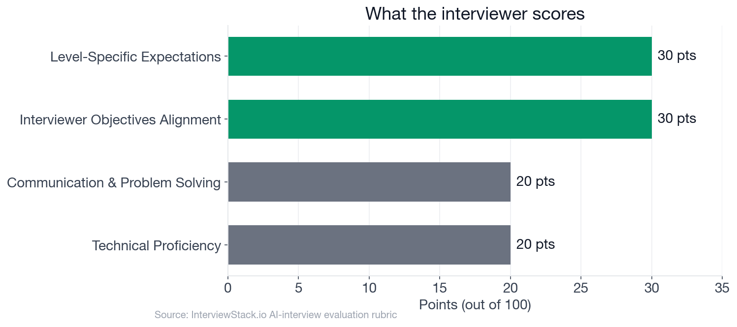
Interviewer Objectives Alignment and Level-Specific Expectations each hold 30 points; Technical Proficiency and Communication & Problem Solving hold 20 points apiece, so most of the score rewards structural judgment, not a specific taxonomy choice.
What Is the Interviewer Actually Asking You to Structure?
The interview question
You're joining a product team that is redesigning the Help & Account area for a large consumer subscription product. Today, users struggle to find answers, manage billing, switch plans, and resolve account issues without contacting support. The current experience has grown organically over time: support articles, billing settings, device management, family plan controls, cancellation flows, and contact-support entry points all live in different places with inconsistent labels.
The team wants a cleaner structure that reduces support burden while making it easier for users to complete common account and support tasks on their own. You are working with a PM, a content designer, and an engineer, and you have enough scope to rethink the information architecture and core user flows, but not to redesign the entire product.
How would you redesign the information architecture and user flows for this Help & Account experience?
The interviewer isn't grading vocabulary or a specific taxonomy. The goal is whether you can turn six scattered areas into a structure a real cross-functional team could implement: a coherent grouping and labeling scheme in user language, at least one complete flow with entry points and a recovery path, and reasoning about the trade-offs between what's easy to find and what the business needs to protect, like retention and support cost.
Where the Structure Cracks, Turn by Turn
Meet Mara, a mid-level candidate working through this scenario live. She isn't sloppy: she can sketch a sitemap, she knows what a task flow is, and she uses the right vocabulary. What costs her points is scope: what she tries to cover, what she assumes without asking, and whether her structure survives contact with a messier real user.
Turn 1: What to Learn Before Structuring
Interviewer: "What would you want to learn first about user behavior, content, and business constraints before locking the structure?"
Turn 2: Merge Help and Account, or Keep Them Apart
Interviewer: "How would you decide whether Help and Account should remain separate top-level areas or be merged into a single experience?"
Turn 3: The Cancellation Flow
Interviewer: "How would you handle high-friction flows like cancellation or payment failure while still keeping the experience clear and trustworthy?"
Turn 4: The First Two Weeks of Artifacts
Interviewer: "What artifacts would you produce in the first week or two to align product, engineering, and content on the proposed structure?"
Why Isn't Watching This Enough?
Every mistake above looks obvious once it's laid out with a red box around it. That's the trap of reading a walkthrough: you have time to notice a skipped clarifying question, an artifact list that would slow a team down, a cancellation flow that reads as a dark pattern. None of that distance exists live. You're naming primary users, sketching a grouping logic, walking a flow, and producing artifacts the interviewer can picture, all inside a 30-minute clock with someone reacting to your answer in real time. Closing the gap between spotting a mistake on the page and not making it under pressure only comes from doing this yourself, enough times that the scope-cutting instinct becomes automatic.
What Does a Strong 30-Minute Answer Actually Include?
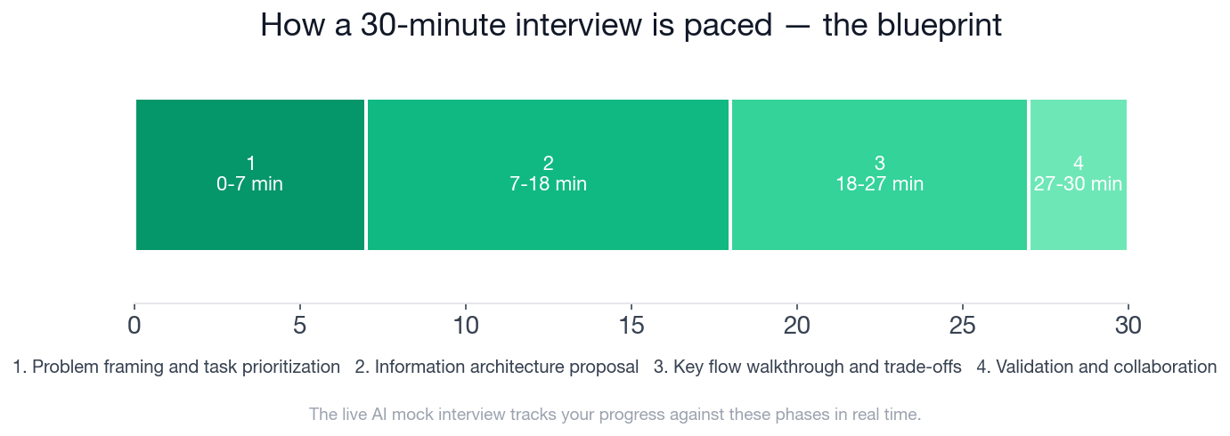
The timeline above shows how the 30 minutes are paced: 7 minutes to frame the problem, 11 on the information architecture proposal, 9 walking a key flow, and a final 3 minutes on validation and collaboration. Below is the full blueprint, phase by phase, with every checklist item a strong candidate hits. This is the exact structure InterviewStack.io's AI interviewer tracks you against in real time during the live mock interview.
- ✓Clarifies likely primary users or segments such as subscribers, family managers, or users in trouble states
- ✓Identifies core jobs-to-be-done such as finding answers, managing plan/billing, fixing access issues, and contacting support
- ✓Calls out current IA issues like inconsistent labels, fragmented entry points, or overlap between content and settings
- ✓Prioritizes a manageable subset of high-value tasks for a 30-minute design discussion
- ✓Proposes a top-level structure that logically organizes help content, account settings, plans/billing, devices, and support escalation
- ✓Uses clear labels that reflect user language rather than internal org structure
- ✓Explains why certain items are grouped together and where ambiguity or overlap may exist
- ✓Addresses discoverability across browse, search, and contextual entry points when relevant
- ✓Shows awareness of scalability for additional content types, plans, or account complexity
- ✓Walks through at least one critical flow end-to-end, such as changing a plan, resolving payment failure, or cancellation
- ✓Defines clear entry points, user decisions, system states, and completion outcomes
- ✓Mentions alternative paths for users who cannot self-serve and need support escalation
- ✓Accounts for trust-sensitive moments with clear information, confirmation, and recovery paths
- ✓Discusses trade-offs between reducing support contacts, preserving retention, and maintaining user clarity
- ✓Names lightweight artifacts they would create, such as a sitemap, flow diagrams, content inventory, or low-fi wireframes
- ✓Suggests a realistic validation method such as tree testing, card sorting, usability testing, or support-log review
- ✓Mentions success signals like task success, time to complete, reduced support contacts, or findability improvements
Turn Six Areas Into Four Jobs, Live
Reading Mara's four turns is not the same as producing your own structure against a live clock, with an interviewer asking a follow-up you didn't prepare for. Close that gap by running the scenario yourself: start a live AI mock interview on information architecture and user flows and get scored against this exact rubric in real time, phase by phase. To build the underlying concepts first, the information architecture and user flows question bank breaks the topic into focused drills, and the preparation guides cover what to expect in company-specific UX design interviews.
FAQ
Q. What does a UX Designer information architecture and user flows interview actually test?
It tests whether you can turn a genuinely scattered set of content areas into a structure a cross-functional team could implement: a coherent grouping and labeling scheme, at least one complete user flow with entry points and recovery paths, and reasoning about trade-offs like findability against business needs such as retention. Interviewer Objectives Alignment and Level-Specific Expectations each carry 30 of the interview's 100 points, with Technical Proficiency and Communication & Problem Solving worth 20 points apiece.
Q. How much time do I get to frame the problem before proposing a structure?
Problem framing and task prioritization runs from minute 0 to minute 7, just 7 minutes, before the interview moves into the information architecture proposal. Candidates who spend that window trying to catalog all six scattered content areas in equal depth run out of runway for the flow walkthrough and validation phases that come later.
Q. Should Help and Account stay separate or merge into one experience?
There is no single correct answer; what the interview actually rewards is naming the real trade-off, contextual findability against duplicated entry points, and resolving it with a reason tied to user tasks or support-contact patterns rather than a stated preference with no rationale behind it.
Q. What artifacts should a UX Designer bring to align a cross-functional team in the first two weeks?
Lightweight ones: a one-page sitemap of the new grouping, two or three critical task flows drawn as simple diagrams, and a short content inventory mapping old locations to new ones. High-fidelity mockups are explicitly out of scope for this topic; the interview is testing structural thinking, not visual polish.
Q. How should a cancellation or payment-failure flow be designed in this interview?
With explicit trust-sensitive handling: an information step on what actually changes, a confirmation step, and a recovery path such as a pause option or a short undo window, alongside an honest trade-off between reducing support contacts and preserving retention without obstructing the cancel action itself.
Q. Is this a real company's interview question?
No. The scenario is illustrative of how a strong information architecture and user flows interview runs at the mid-level for a UX Designer, not a leaked question from a specific employer.
Q. Where can I practice this exact scenario?
Start a live AI mock interview built on this blueprint. It runs the same 30-minute, four-phase structure and scores you against the same rubric in real time, or drill individual questions first in the information architecture and user flows question bank.
Four Jobs, Not Six Areas
The candidates who leave this interview with a structure a real team could ship aren't the ones who list every scattered area from the prompt. They're the ones who cut six areas down to a handful of real user jobs before drawing a single box, then prove the cut holds up under a flow, a scaling question, and a trust-sensitive edge case. Run the live mock interview and find out whether your scope survives the same pressure.
Topics
Ready to practice?
Put what you've learned into practice with AI mock interviews and structured preparation guides.