
The UX Designer Design Handoff and Developer Collaboration Interview Turns on What You Won't Compromise
A sticky order summary works everywhere in Figma. It does not work everywhere in production, and the moment an engineer says so is exactly where most mid-level candidates lose the thread in a UX Designer interview on design handoff and developer collaboration. This walkthrough runs on a real interview blueprint, generated by the same production prompt InterviewStack.io's AI interviewer uses for a mid-level design handoff scenario, scored across four rubric dimensions worth 100 points.
The scenario: a redesigned mobile checkout flow for a high-traffic commerce surface, with a sticky order summary, editable shipping and payment sections, inline validation, and a new payment-loading state, all approved and due to ship before a seasonal traffic spike. Engineering flags that the design system is not fully supported on this surface and that the sticky summary is risky on one platform. The candidate has 30 minutes to prove the handoff survives contact with that constraint, not just that the mocks look finished. Watch where a prepared candidate loses points anyway, then get the complete graded blueprint to practice against yourself.
Key Findings
- This is a 30-minute mid-level UX Designer interview on Design Handoff and Developer Collaboration, scored across 4 rubric dimensions worth 100 points total.
- Interviewer Objectives Alignment and Level-Specific Expectations each carry 30 points, 60 of the 100 total, before Technical Proficiency (20 points) or Communication & Problem Solving (20 points) is even weighed.
- Problem framing and handoff strategy is the shortest phase at just 8 minutes (0-8), and it already expects the launch-timing-versus-fidelity tension named out loud.
- Artifact detail and implementation guidance is the longest phase at 12 minutes (8-20) and carries 5 separate checklist items spanning states, tokens, and responsive behavior.
- Trade-offs, conflict resolution, and validation fills the final 10 minutes (20-30) and grades whether a candidate can tell a must-keep outcome from a flexible detail.
- 4 skill areas are explicitly out of scope for this topic, including front-end coding exercises and org-wide design-ops strategy.
- Level-specific expectations set the bar at feature-level scope: candidates are not expected to anticipate every platform nuance upfront, only the most important states and risks.

Interviewer Objectives Alignment and Level-Specific Expectations each hold 30 points; Technical Proficiency and Communication & Problem Solving hold 20 points apiece, so most of the score rewards judgment under constraint, not visual polish.
What Is the Interviewer Actually Trying to Protect?
The interview question
You're joining an existing product team at a large consumer tech company. The team is preparing to launch a redesigned mobile checkout flow for a high-traffic commerce surface. The visual design is approved, engineering starts implementation next week, and there is known tension between design quality and delivery speed because the team wants to ship before a seasonal traffic spike.
Your design introduces a sticky order summary at the bottom of the screen, editable shipping and payment sections, inline validation for promo codes and address errors, a new loading state during payment submission, and updated spacing, typography, and button treatments meant to align with the company's design system. The engineers tell you that parts of the design system are not yet fully supported on this surface, and one platform has limitations around the sticky summary behavior.
How would you drive the handoff and collaboration with engineering so this checkout experience ships as intended while staying realistic about technical constraints and timeline pressure?
The mocks are already approved, so the interviewer is not grading whether the design looks good. The real test is whether you can turn that polish into guidance an engineering team can actually build from, protect the core user intent when a platform pushes back, and communicate states, accessibility expectations, and acceptance criteria clearly enough to ship with minimal rework.
Where the Handoff Cracks, Turn by Turn
Meet Simone, a mid-level candidate working through this scenario live. Simone knows the vocabulary: tokens, redlines, acceptance criteria. What costs Simone points is judgment: when to hold a line, when to let one flex, and whether that distinction gets made in the moment.
Turn 1: What the Handoff Actually Includes
Interviewer: "What would you include in your handoff artifacts so engineers can implement this without repeatedly coming back for clarification?"
Turn 2: The Sticky Summary Standoff
Interviewer: "If engineering says the sticky order summary is too risky on one platform, how would you decide what to preserve, what to change, and how to document that decision?"
Turn 3: Naming Every State Out Loud
Interviewer: "How would you communicate interaction details like inline validation, loading, disabled, and error states so they are implemented consistently?"
Turn 4: When QA Looks Fine but Is Not
Interviewer: "What would you do if you discovered during QA that the built experience visually matches mocks but behaves differently in edge cases?"
What Changes When the Engineer Is Waiting on Your Answer Right Now?
Every mistake above looks obvious with a red box drawn around it. That is the trap of reading a walkthrough: you have time to notice a missing acceptance note, a standoff over a fixed position, a state nobody named. None of that distance exists live. An engineer is waiting on your answer mid-standup, a PM wants the trade-off explained in one sentence, and the clock does not pause while you think. Closing the gap between spotting a mistake on the page and not making it under pressure only comes from running the scenario yourself, enough times that separating outcome from detail becomes automatic, which is exactly what the live AI mock interview is built to pressure-test.
The Blueprint Runs From Framing to Validation in Three Phases
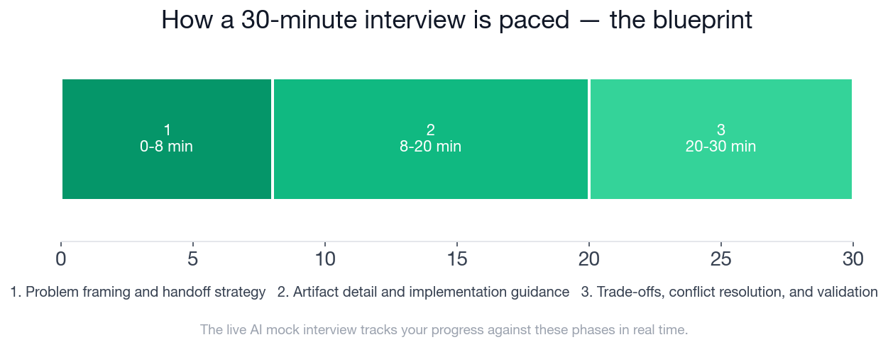
The timeline above shows how the 30 minutes are paced: 8 minutes to frame the handoff strategy, 12 minutes on artifact detail and implementation guidance, and a final 10 minutes on trade-offs, conflict resolution, and validation. Below is the full blueprint, phase by phase, with every checklist item a strong candidate hits. This is the exact structure InterviewStack.io's AI interviewer tracks you against in real time during the live mock interview.
- ✓Clarifies the product situation, engineering timing, and key risks before proposing a process
- ✓Identifies that handoff is more than static screens and includes behavior, states, and constraints
- ✓Outlines a sequence such as kickoff alignment, spec preparation, engineer walkthrough, and implementation support
- ✓Recognizes the tension between launch timing and design fidelity early in the conversation
- ✓Describes concrete handoff contents such as component references, spacing/token usage, redlines when needed, content rules, and acceptance notes
- ✓Covers major interaction states including default, focus, editing, loading, success, error, disabled, and empty or invalid conditions where relevant
- ✓Explains how responsive or platform-specific behavior would be documented for the sticky summary and editable sections
- ✓References accessible behavior in observable terms such as error messaging clarity, focus order, touch targets, contrast, and screen state feedback
- ✓Shows awareness of when to rely on design system components versus creating one-off specs because support is incomplete
- ✓Separates must-keep user outcomes from flexible visual or motion details when engineering pushes back
- ✓Proposes a clear way to align PM and engineering on cuts, fallback behaviors, or phased delivery
- ✓Describes reviewing implementation through build checks, bug filing, severity triage, and concise feedback loops
- ✓Mentions validating edge cases in QA rather than checking only happy-path fidelity
- ✓Escalates appropriately when a technical compromise would materially harm usability, trust, or conversion
Ready to Defend This Call Under the Clock?
Reading Simone's four turns is not the same as making the sticky-summary call yourself, live, with an interviewer probing why you chose to flex one detail and hold another. Close that gap: start a live AI mock interview on design handoff and developer collaboration and get scored against this exact rubric in real time, phase by phase. To build the underlying judgment first, the design handoff and developer collaboration question bank breaks the topic into focused drills, and the preparation guides cover what to expect in company-specific UX design interviews. If today's scenario is more handoff than structure, the UX Designer information architecture and user flows walkthrough covers the structural side of the job.
FAQ
Q. What does a UX Designer design handoff and developer collaboration interview actually test?
It tests whether you can turn an approved design into engineering guidance a team can build from: concrete handoff artifacts beyond static screens, clear interaction states, and trade-off judgment when a platform constraint conflicts with the original design. Interviewer Objectives Alignment and Level-Specific Expectations each carry 30 of the interview's 100 points, with Technical Proficiency and Communication & Problem Solving worth 20 points apiece.
Q. How much time do I have to frame a handoff strategy before diving into artifacts?
Problem framing and handoff strategy runs from minute 0 to minute 8, just 8 minutes, before the interview moves into artifact detail and implementation guidance. That phase's checklist already expects the launch-timing versus design-fidelity tension to be named early, not held until the trade-offs phase at the end, so candidates who skip straight to specs miss that early signal.
Q. Do I have to keep a design element exactly as designed if engineering flags a platform constraint?
No, and insisting on it is a common mistake. The interview rewards separating the user outcome a design element protects, for example keeping the order total visible during checkout, from the specific implementation detail, such as a fixed sticky position, so you can adapt the detail without losing the outcome.
Q. What should go into a UX Designer's handoff artifacts?
More than the approved screens: component references and design-token or spacing usage engineers can trace back to the design system, explicit content and copy rules, redlines where a component does not cover the case, and acceptance notes describing what "done" looks like for each screen. The checklist explicitly treats handoff as more than static screens.
Q. How should design tokens or components be used if the design system is not fully supported on a given surface?
Use existing tokens and components everywhere they are available, and call out explicitly where they are not, documenting a one-off spec for that specific gap rather than forcing an unsupported pattern or letting engineering improvise silently. The checklist rewards knowing when to lean on the system versus when to hand-spec.
Q. Is this a real company's interview question?
No. The scenario is illustrative of how a strong design handoff and developer collaboration interview runs at the mid-level for a UX Designer, not a leaked question from a specific employer.
Q. Where can I practice this exact scenario?
Start a live AI mock interview built on this blueprint. It runs the same 30-minute, three-phase structure and scores you against the same rubric in real time, or drill individual questions first in the design handoff and developer collaboration question bank.
One Outcome, Whatever the Platform Allows
The candidates who leave this interview with a handoff engineering can actually build from are not the ones who defend every pixel. They are the ones who can say, out loud and under pressure, which outcome the design protects and which detail was only ever one way to get there. Run the live mock interview and find out whether your own trade-off calls hold up under the same clock.
Topics
Ready to practice?
Put what you've learned into practice with AI mock interviews and structured preparation guides.